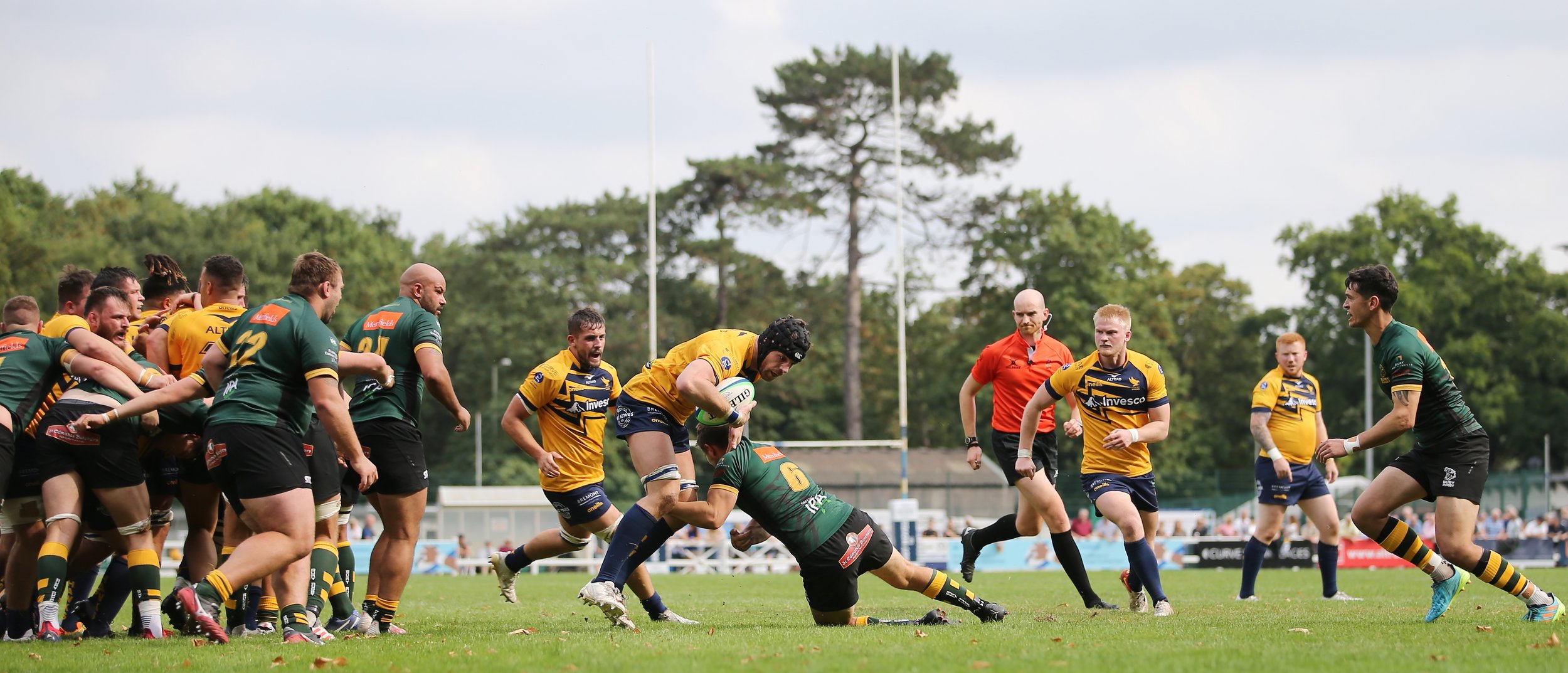
Henley Rugby Football Club was founded in 1930. After many years, the club’s brand needed an update.
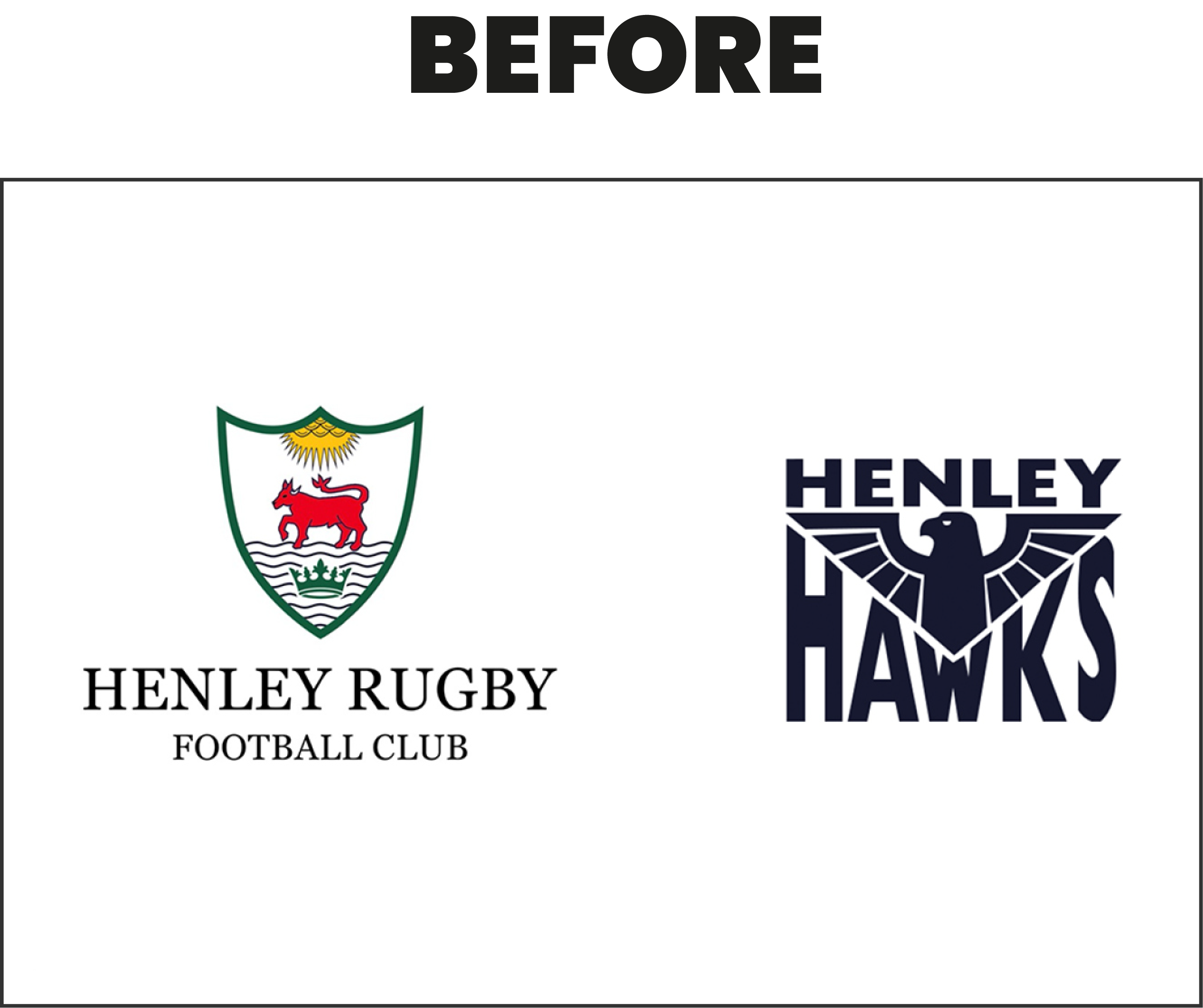
The brief was to refresh both the existing club and team (Henley Hawks) logos and bring visual cohesion to Henley RFC.
Alongside some careful stakeholder management across the club and community, WYS communications developed a fresh & contemporary look that encapsulated the club’s proud history.
The new club crest took elements of the original badge and paid homage to the heritage of the area, modernising the ox, and updating his tail with one that references the Henley-on-Thames coat of arms.
 | 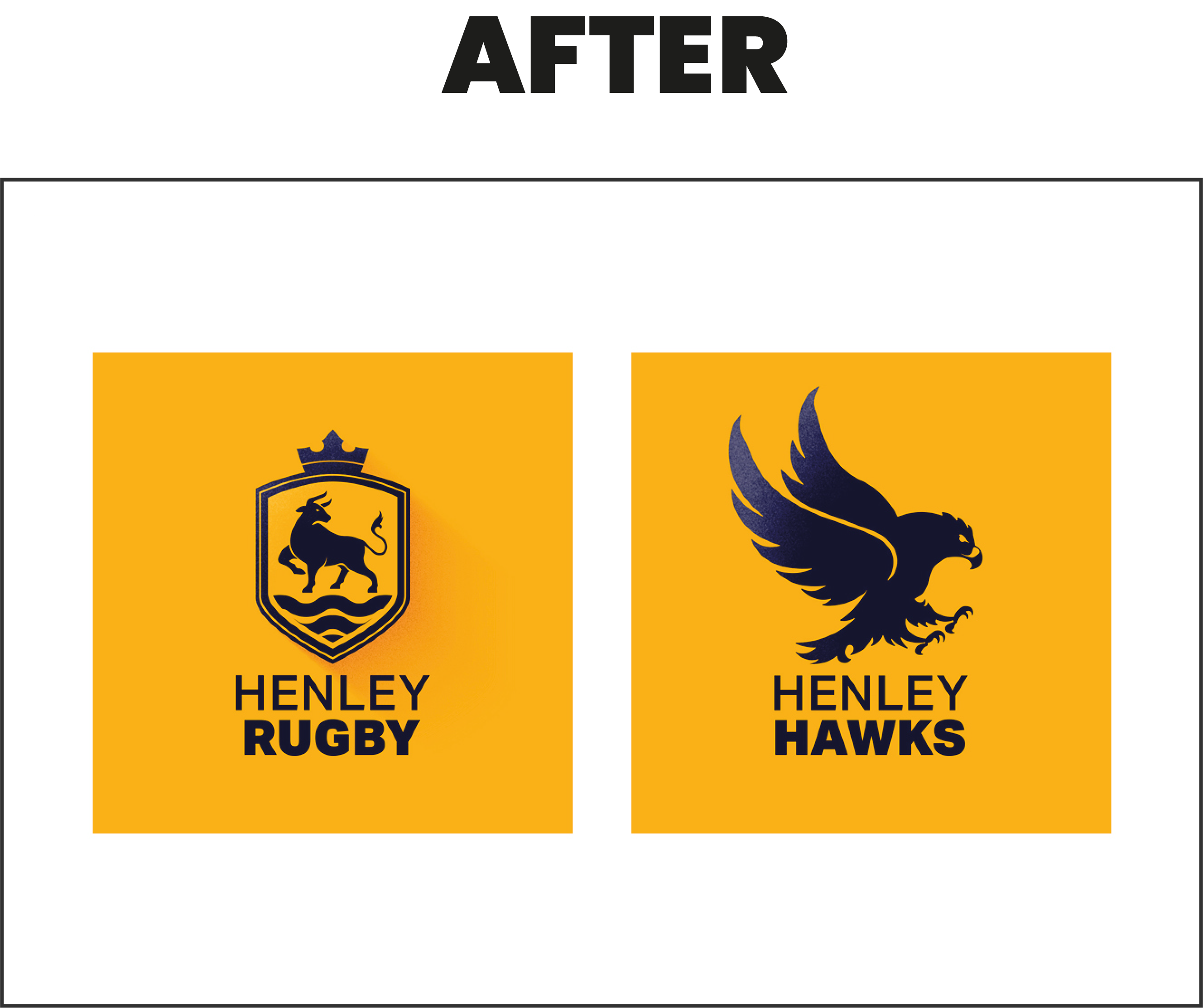 |
We also illustrated a revised hawk in flight with extended talons for the 1st XV badge and used consistent naming for visual consistency between club and team.
The club shield became a design device used throughout creative applications to help frame imagery, paired with a pattern inspired by the hawk’s plumage that can be found across club collateral, including their latest kit.
We produced a refreshed, reduced colour palette, and a brand guideline for the club and partners to implement the new identity across digital, print assets, OOH, kit, sportswear and other merchandise.
This project marked the start of a new era for Henley Rugby Club and was met with warm reception from the board, players and fans and cold pints in the club house.
![]()